Modal responsive configurable por tamaño. Ancho y alto configurable con opción de ventana completa.
Modal responsive configurable por ancho y alto. Permite activar scroll en contenido
- Se utiliza normalize.css
- Los modificadores de ancho y alto son mcr-content.mc-hg-x y mcr-content.mc-wd-x donde x es un número entre 0 y 4 siendo 4 la modalidad full-window
- La clase mcr-content .mg0 que resetea los margenes de cualquier elemento dentro de content
- El modal se ajusta al tamaño del configurado en el elemento div.mcr-content por lo tanto es ahí donde se debe aplicar los modificadores de altura y anchura
- Para activar el scroll se debe aplicar la clase mc-scroll-y al elemento div.mcr-content
-
Según se va cambiando de tamaño el responsive aplica media queries que cambian el color del borde. Solo es un ejemplo y se pueden quitar.
    .mo-container {
      border:0.188rem solid violet;
    }
styles.css
/*la css minificada la puedes obtener de mi github*/
@import url('https://fonts.googleapis.com/css2?family=Roboto:wght@400;500;700&display=swap');

body {
  font-family: 'Roboto', sans-serif;
  color: #303030;
  background: #f2f2f2;
  font-size: 16px;
}

:root{
  --main-blue:#1766DC;
  --main-blue-2:#2366C9;
  --main-white:#f2f2f2;
}

.mod-overlay {
  width: 100vw;
  height: 100vh;
  position: fixed;
  top:0;
  left:0;
  margin:0;
  padding: 0;
  background: rgba(0, 0, 0, .5);
  display: flex;
  align-items: center;
  justify-content: center;
}

.mod-hide {
  display: none;
}

.mo-container {
  margin:0;
  padding: 0;
  background: #fff;
  position: relative;
  border-radius: 0.32rem;
  box-shadow: rgba(100,100,111, 0.2) 0px 7px 29px 0px;
  padding: 0.938rem;
}

.mo-container * {
  margin:0;
  padding:0;
}

.mcr-head {
  display: flex;
  align-items: center;
  justify-content: space-between;
  padding-bottom: 0.938rem;
  border-bottom: 2px solid #E8E8E8;
}

.mcr-head h1 {
  font-weight: 500;
  font-size: 1rem;
  color:var(--main-blue);
}

.mcr-button-x {
  position: absolute;
  top: 0.6rem;
  right: 0.40rem;
  width: 1.87rem;
  height: 1.87rem;
  border: none;
  background: none;
  cursor: pointer;
  transition: .3s ease all;
  border-radius: 0.31rem;
  color: var(--main-blue);
}

.mcr-button-x:hover {
  background: #f2f2f2;
}

.mcr-button-x svg{
  width: 100%;
  height: 100%;
}

.mcr-content {
  display: flex;
  flex-direction: column;
  align-items: center;
  /*
  la altura se elimina, como el container depende del content, crece por fuera de los limites top y height ocultando su contenido y no
  muestra scroll
  si defino una latura, la caja container se ajusta a esta y crea un scroll si es necesario.
  Por lo tanto para ajustar el alto, se hace aqui
  */
  width: calc(100vw - 6.25rem);
  height: calc(100vh - 7.813rem);
  min-width: 21.875rem;
  overflow-y: hidden;
  overflow-x: hidden;
  border:1px solid var(--main-white);
  padding: 0.625rem;
  padding-left: 0.938rem;
  padding-right: 0.938rem;
}

.mcr-content h2 {
  font-size: 2.625rem;
  font-weight: 700;
  margin-bottom: 0.938rem !important;
}

.mcr-content h3 {
  font-size: 2rem;
  font-weight: 600;
}

.mcr-content h4 {
  font-size: 1.75rem;
  font-weight: 600;
}

.mcr-content h5 {
  font-size: 1.50rem;
  font-weight: 600;
}

.mcr-content h6 {
  font-size: 1.25rem;
  font-weight: 600;
}

.mcr-content h3, h4, h5, h6 {
  width: 100%;
  margin-bottom: 0.938rem !important;
}

.mcr-content.mc-scroll-y {
  overflow-y: scroll;
}

.mcr-content.mc-wd-4 {
  width: 96.75vw;
}

.mcr-content.mc-wd-3 {
  width: 75vw;
}

.mcr-content.mc-wd-2 {
  width: 50vw;
}

.mcr-content.mc-wd-1 {
  width: 25vw;
}

.mcr-content.mc-wd-0 {
  width: 15vw;
}

.mcr-content.mc-hg-4 {
  height: 90.75vh;
}

.mcr-content.mc-hg-3 {
  height: 75vh;
}

.mcr-content.mc-hg-2 {
  height: 50vh;
}

.mcr-content.mc-hg-1 {
  height: 25vh;
}

.mcr-content.mc-hg-0 {
  height: 15vh;
}

.mcr-content p {
  font-size: 1.125em;
  width: 100%;
  margin-top: 0;
  margin-bottom: 0.938rem;
}

.mcr-content .mg0 {
  margin: 0;
}

.mcr-content .mgt {
  margin-top: 0.938rem;
}

.mcr-content img {
  width: calc(100% - 0.938rem);
  border: 0.050rem solid #7EA6C9;
  padding: 0.313rem;
  margin-bottom: 0.938rem;
}

.mcr-content .btn {
  font-size: 0.94rem;
  padding: 0.625rem;
  cursor: pointer;
  border-radius: 0.938rem;
  border-width: 1px;
}

.btn-blue {
  font-size: 0.94rem;
  width: 6.25rem;
  border-color: var(--main-blue-2);
  background: var(--main-blue);
  color: #f2f2f2;
}

::-webkit-scrollbar {
  width: 0.438rem;
}

::-webkit-scrollbar-track {
  width: 0.25rem;
  background: var(--main-white);
}

::-webkit-scrollbar-thumb {
  background-color:  var(--main-blue);
  border-radius: 0.313rem;

}

  /*monitor laptop*/
@media (max-width:1458.8px){
  .mcr-content.mc-wd-4 {
    width: 95.75vw;
  }
  .mcr-content.mc-hg-4 {
    height: 88vh;
  }
}

@media (max-width:1399.98px){
  /*to-do*/
  .mo-container {
    border:0.188rem solid deepskyblue;
  }
}

@media (max-width:991.98px){
  body {
    font-size: 15px;
  }
  .mo-container {
    border:0.188rem solid goldenrod;
  }
}

@media (max-width:767.98px){
  body {
    font-size: 14px;
  }
  .mo-container {
    border:0.188rem solid indianred;
  }
}

@media (max-width:575.98px){
  body {
    font-size: 13px;
  }
  .mo-container {
    border:0.188rem solid violet;
  }
}
Html
<link rel="stylesheet" href="https://necolas.github.io/normalize.css/latest/normalize.css">
<link rel="stylesheet" href="style.css" type="text/css" media="all" />
...
<body>
<div class="mod-overlay">
<div class="mo-container">
<div class="mcr-head">
<h1>This is the modal h1 blue title</h1>
</div>
<button class="mcr-button-x">
<svg xmlns="http://www.w3.org/2000/svg" width="16" height="16" fill="currentColor" class="bi bi-x" viewBox="0 0 16 16">
<path d="M4.646 4.646a.5.5 0 0 1 .708 0L8 7.293l2.646-2.647a.5.5 0 0 1 .708.708L8.707 8l2.647 2.646a.5.5 0 0 1-.708.708L8 8.707l-2.646 2.647a.5.5 0 0 1-.708-.708L7.293 8 4.646 5.354a.5.5 0 0 1 0-.708z"/>
</svg>
</button>
<div class="mcr-content mc-scroll-y">
<h2>This is an h2 centered title</h2>
<h3>Subtitle h3</h3>
<p>
Lorem ipsum dolor sit amet consectetur ...
</p>
<h4>Subtitle h4</h4>
<p>
Lorem ipsum dolor ...
</p>
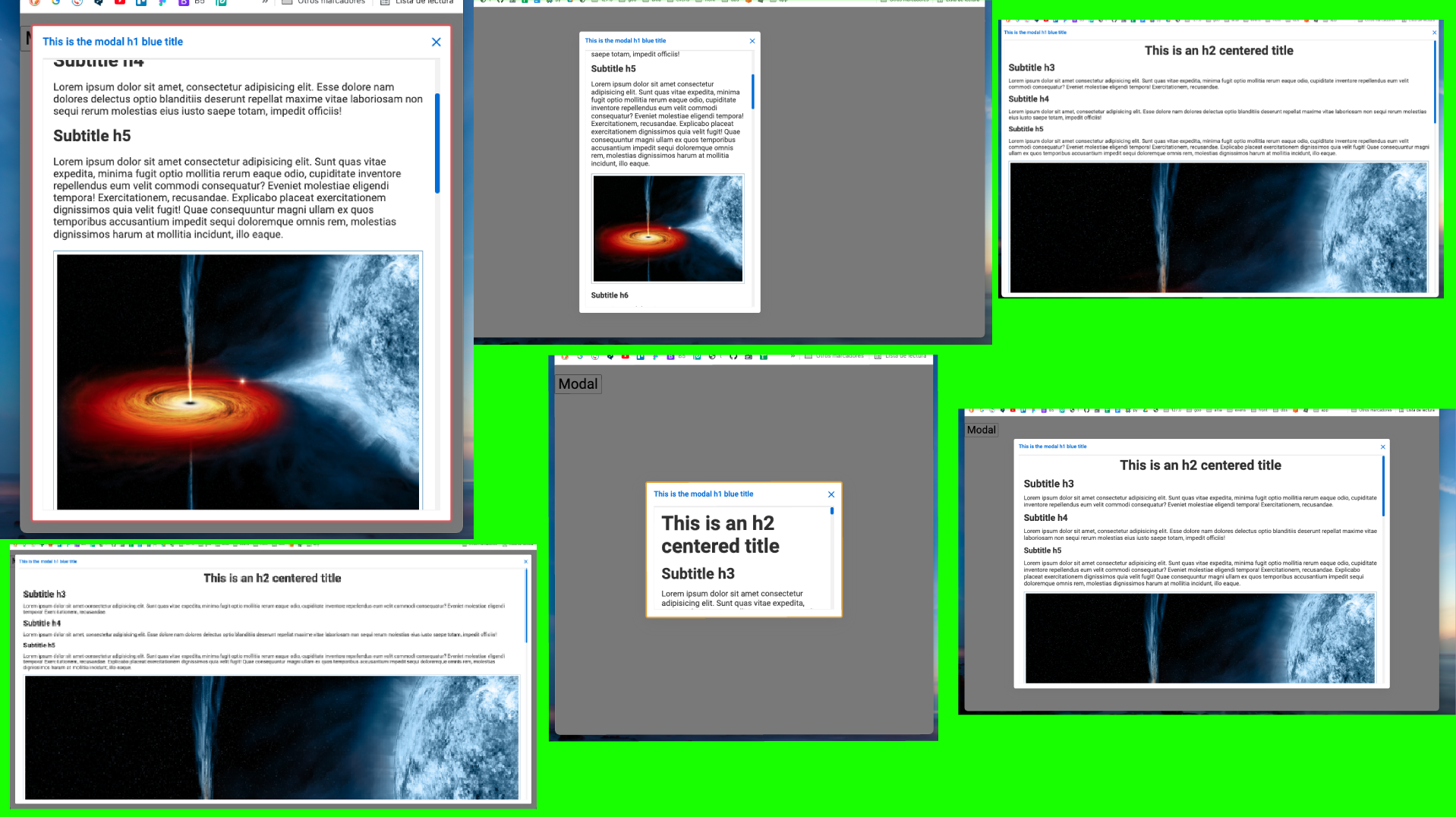
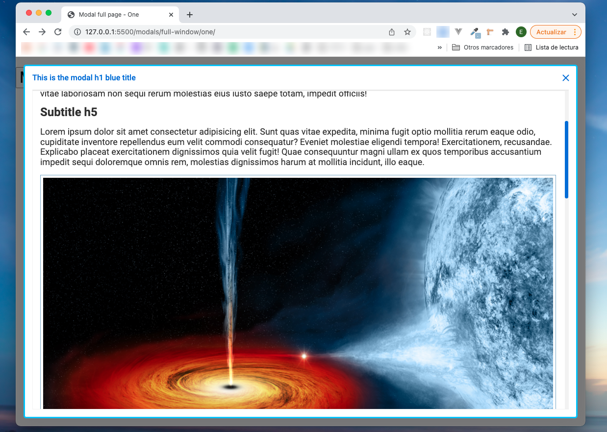
<h5>Subtitle h5</h5>
<p>
Lorem ipsum dolor sit amet consectetur adipisicing elit. Sunt quas vitae expedita, minima fugit optio mollitia
cupiditate inventore repellendus eum velit commodi consequatur? Eveniet molestiae eligendi tempora!
Exercitationem, recusandae. Explicabo placeat exercitationem dignissimos quia velit fugit! Quae consequuntur magni
emporibus accusantium impedit sequi doloremque omnis rem, molestias dignissimos harum at mollitia incidunt, illo eaque.
<img loading="lazy" class="mg0 mgt" src="https://upload.wikimedia.org/wikipedia/commons/9/98/Black_hole_Cygnus_X-1.jpg"/>
</p>
<h6>Subtitle h6</h6>
<p>
Lorem ipsum dolor sit amet consectetur adipisicing elit. Sunt quas vitae expedita, minima fugit optio mollitia rerum eaque odio
...
</p>
<h6>Subtitle h6</h6>
<p>
Lorem ipsum dolor sit amet consectetur adipisicing elit. ...
</p>
<button class="btn btn-blue">Aceptar</button>
</div>
</div>
</div>
</body>
Dejo un enlace al código fuente en mi github
Autor: Eduardo A. F.
Publicado: 18-12-2021 17:42